Tips for Incorporating Foil with Envelopes for The First Time:
When a client is using foil for the first time on their envelope, we typically like to have a few meetings with them to review the best ways to incorporate this beautiful and eye-catching feature into their design. In this blog we compiled a few key tips that are usually discussed in helping make foil a massive success for any organization’s direct mail branding. These tips are a great starting point but this list is by no means all-encompassing. We have been foil stamping direct mail for over 40 years and our experienced team is always willing to help guide you through adding this proven, response increasing feature!
Tip #1: Keep it Simple!
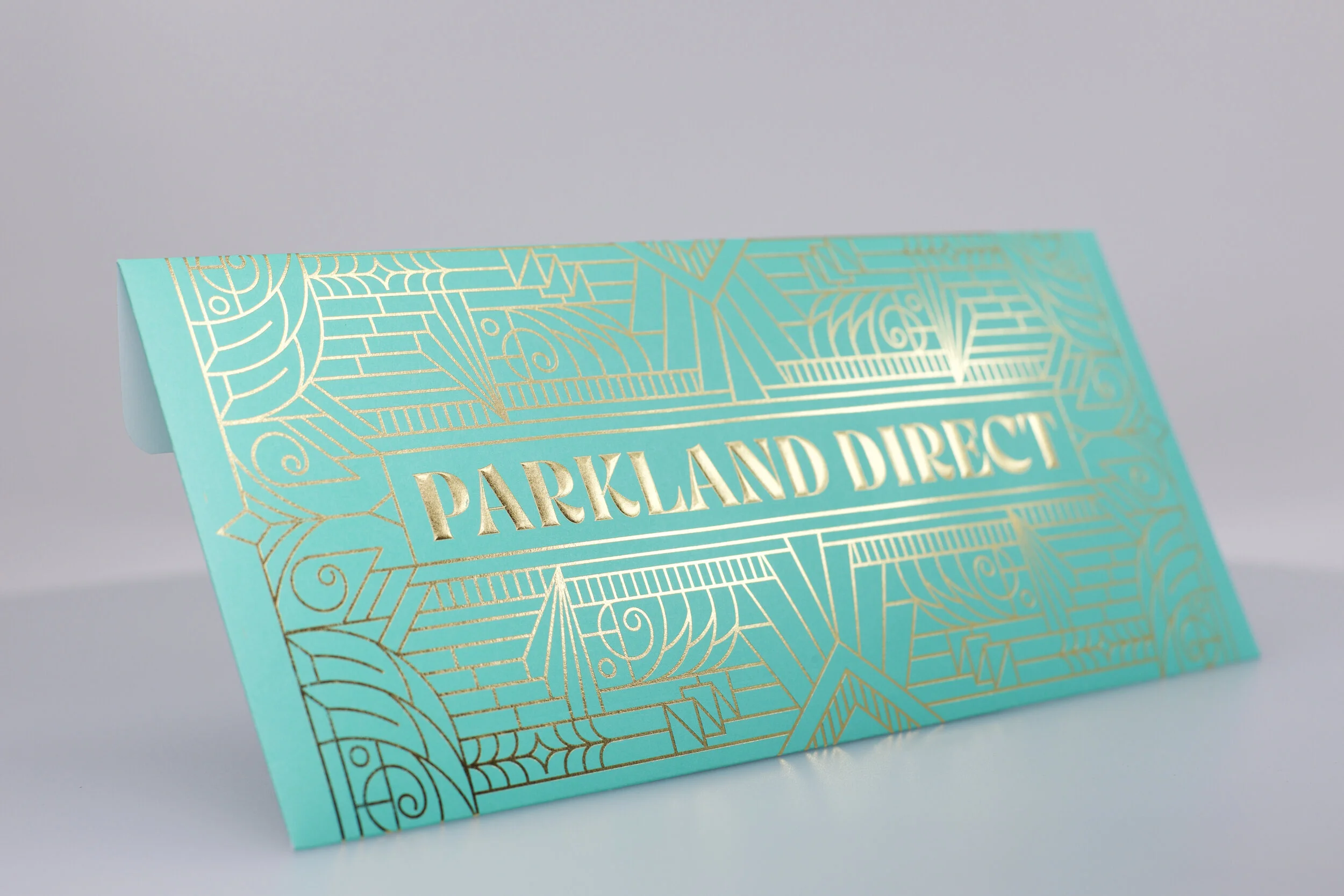
There are literally hundreds of foil colors and patterns to choose from, offered by some great companies like Kurz, Foilco, Univacco, and Infinity. It can sometimes feel overwhelming at first when trying to decide how and what to incorporate on your envelope. Keep in mind that any foil will add a look, texture, and beauty unlike any other, so we always encourage our clients not to overthink all the options. Many times, a great first step is keeping your choices simple, and starting with a “standard” foil like gold or silver. We use the word “standard” with pause because foil is anything but that. Even with commonly used foil colors you are sure to get an unmatched look in the mailbox, resulting in your envelope getting noticed and opened. And typically foils like silver and gold come at a lower price point than ones like holographic patterns, making them more budget friendly.
Tip #2: Use Existing Art.
Piggybacking on Tip #1, another great way to keep it simple is to use existing creative/art. Try taking key areas or words on the envelope, that grab the recipient’s attention, and change them to foil. This way you won’t have to redesign your branding and creative from the ground up. Our team can help you find ways to get the most out of adding foil to any creative, while garnering the most attention and keeping costs low! With all the options available for foil, we can certainly find a color or pattern that fits your brand and creative perfectly. Additionally, applying foil to existing creatives that have been used before serves as a great way to test against a control package.
Tip #3: Contrasting Substrates Can Offer Extra Pizzazz.
There is nothing quite like the sheen and noticeability that foil gives. However, it most often works best when it is not competing for attention on the envelope. On this note, we recommend our clients use a substrate that is opposite of the foil finish. For example, a gloss foil finish with a matte or uncoated paper, or a matte/dull foil finish with gloss paper. This will allow for stellar contrast between the substrate and foil, immediately focusing your audience’s attention to key areas, and holding it for those crucial seconds.
Tip #4: Don’t Overdo It.
As we mentioned before, nothing will grab someone’s attention and make your product more preferable to a consumer quite like foil will. However, that does not mean it needs to be on every area of the envelope. When adding too much foil you can run the risk of it being too busy or distracting, and not drawing your consumers eyes to that crucial call-to-action point. Using foil in key areas like a teaser, numbers that you want to stand out, or an exclusive offer, will certainly be enough to grab your recipient’s attention and get your envelope opened. Furthermore, foil is priced based on the amount used, so reducing the coverage area can help keep costs very affordable. However, your branding and creative vision may call for more foil, so ultimately it is up to you and your team to decide how you would like to represent your brand.
Tip #5: Try Embossing. (Micro or True Emboss)
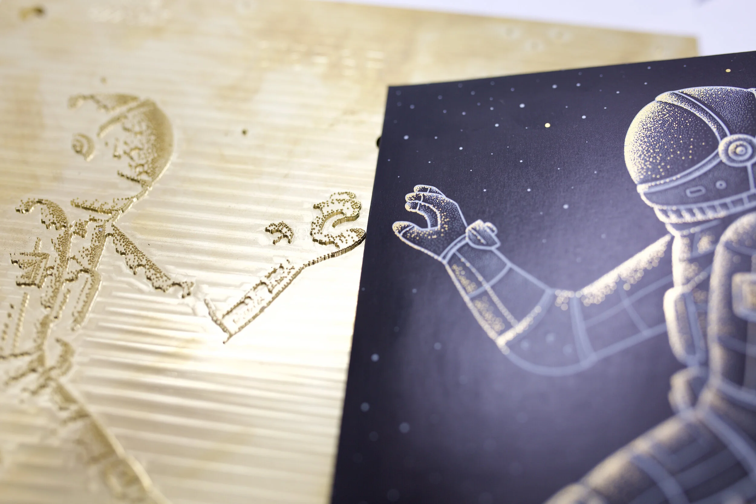
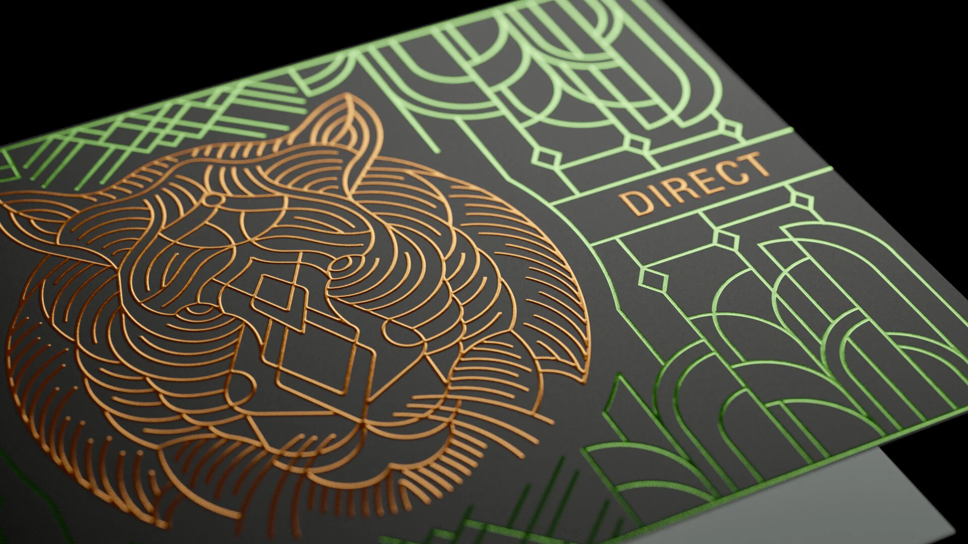
Embossing will bring a look and tactile feel that will certainly increase your envelope’s noticeability and the perceived value of your brand. The great thing about either a Micro-Embossing or true embossing is that it can be produced in line with foil by a very simple and inexpensive die change. The use of haptics has been shown to increase a brand’s trust and value, and greatly improves response rates. For the best results with true embossing, we recommend using heavier weight paper (80# text and higher). A micro-embossing or pattern embossing will achieve great results on any substrate.
Bonus Tip (For Designers)
A great resource for learning more about designing with foil is the Unboxd Podcast. Episodes 15 and 17 feature Kurz’s Marketing Coordinator, April Lytle. It’s a short form Q&A interview that is packed full of great information and advice on things to consider when designing print with foil.
As with adding any new features or embellishments to envelopes, we recommend testing them against a control first to see how it performs. Foiling is proven to achieve mind blowing results in direct mail and the USPS 2022 Tactile & Sensory Promotion will offer a 4% discount on postage when using foil, so what better time than now to give it a try!
Our team is ready and available to assist with any questions you may have on incorporating foil. Please feel free to reach out to us at: envelopes@parklanddirect.com. We’re happy to help!


